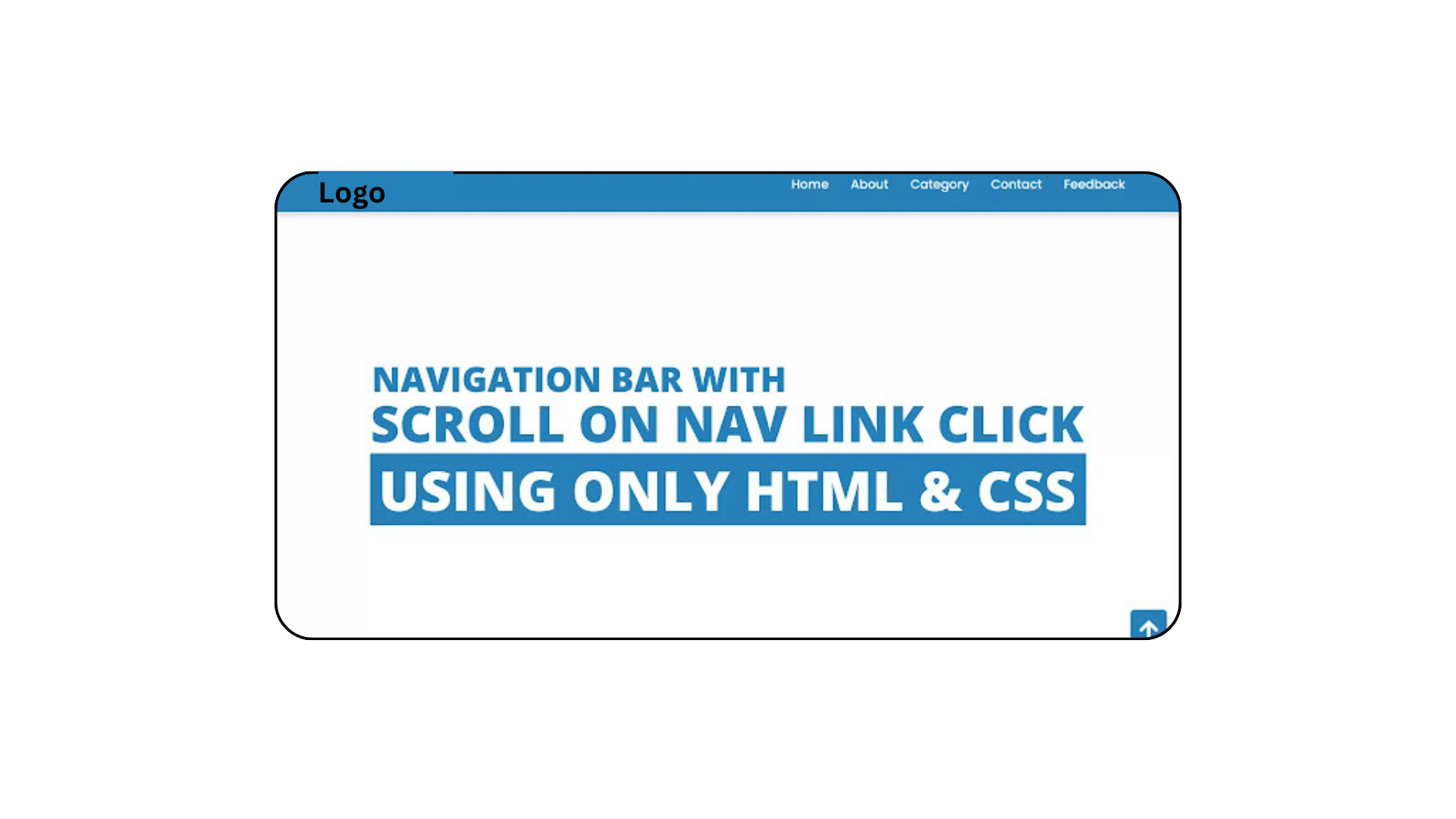
Navigation Bar with Scrolling to the Top Button
Q: How To Scroll to a particular div position when clicking on a link from another page?
ANSWER: You will undoubtedly be able to make the page scroll to each area while clicking on the navigation link after reading the following article and seeing the accompanying video lesson.
Friends, today you will learn how to design a navigation bar with a Scroll To Top button and a Scroll To Every Section button using only HTML and CSS. As you are all aware, I have produced a number of video lessons on website design and navigation bars, but I haven’t produced a special video explaining how navigation links scroll across each part when clicked.
Simply we can understand Navigation bar is the horizontal section on the website that contains various hyperlinks and logos. Hyperlinks help users to a quick move to the particular section or webpages which is related to that nav links.
As we can see the sample of the navigation menu on the webpage. The horizontal section that we can see at the top of the image is our navigation bar. On the left side, there is one logo and on the right side, there are some hyperlinks. On the top side, there is one button. Basically, when we clicked on those navigation links, a related section with that particular links appears smoothly and when we clicked on that arrow up button our main home page appears.
To see the real example and animation of this programming and every code behind creating this scrolling navbar, I have provided a full video tutorial below.
Page Scroll To Every Section Scroll To every Section | Video Tutorial
As you have seen in the given video tutorial. I have kept all hyperlinks in a specific anchor tag. In the section elements, I have given them different IDs and connected their id with hyperlinks (navigation links) simply by doing this our every section starts to appear while clicking on the navigation links.
Also in the scroll to top button, I have given our first section id name (Home), and it starts to scroll to the top while clicking. To make scroll smoother I gave CSS property smooth behavior inside the universal tag(*).
It is a very easy way to make this scrolling while clicking on the link but those friends who are feeling difficulty creating this navigation with scrolling every section can take code from below.
You Might Like This:
- Responsive Neumorphism Navigation Bar using HTML & CSS
- Responsive Navigation Menu Bar Using HTML CSS
- How to Use HTML and CSS to Make a Responsive Fiverr Website
- How To Create Custom QR Codes with HTML, CSS, and JavaScript
Navigation Bar With Page Scroll To Every Section | Free Source Code
To copy the given codes of this programming scroll to every section while clicking on nav links, first, you need to create two files on is an HTML file and another is a CSS file, after creating these two files then you can copy-paste the given codes in your document.
<!DOCTYPE html>
<!-- Created By CodingLab - www.codinglabweb.com -->
<html lang="en" dir="ltr">
  <head>
   <meta charset="UTF-8">
   <title>Navigation Bar With Scroll Every Section</title>
 <link rel="stylesheet" href="style.css">
  <!-- Fontawesome CDN Link -->
    <link rel="stylesheet" href="https://cdnjs.cloudflare.com/ajax/libs/font-awesome/5.15.2/css/all.min.css"/>
     <meta name="viewport" content="width=device-width, initial-scale=1.0">
   </head>
<body>
  <nav>
    <div class="navbar">
      <div class="logo"><a href="#">CodingLab</a></div>
      <ul class="menu">
        <li><a href="#Home">Home</a></li>
        <li><a href="#About">About</a></li>
        <li><a href="#Category">Category</a></li>
        <li><a href="#Contact">Contact</a></li>
        <li><a href="#Feedback">Feedback</a></li>
      </ul>
    </div>
  </nav>
  <section id="Home">Home Section</section>
  <section id="About">About Section</section>
  <section id="Category">Category Section</section>
  <section id="Contact">Contact Section</section>
  <section id="Feedback">Feedback Section</section>
  <div class="button">
    <a href="#Home"><i class="fas fa-arrow-up"></i></a>
  </div>
</body>
</html>
@import url('https://fonts.googleapis.com/css2?family=Poppins:wght@200;300;400;500;600;700&display=swap');
*{
margin: 0;
padding: 0;
box-sizing: border-box;
font-family: 'Poppins', sans-serif;
}
nav{
position: fixed;
left: 0;
top: 0;
width: 100%;
height: 75px;
background: #2980b9;
box-shadow: 0 5px 10px rgba(0, 0, 0, 0.1);
}
nav .navbar{
display: flex;
align-items: center;
justify-content: space-between;
height: 100%;
max-width: 90%;
background: #2980b9;
margin: auto;
}
nav .navbar .logo a{
color: #fff;
font-size: 27px;
font-weight: 600;
text-decoration: none;
}
nav .navbar .menu{
display: flex;
}
.navbar .menu li{
list-style: none;
margin: 0 15px;
}
.navbar .menu li a{
color: #fff;
font-size: 17px;
font-weight: 500;
text-decoration: none;
}
section{
display: flex;
height: 100vh;
width: 100%;
align-items: center;
justify-content: center;
color: #96c7e8;
font-size: 70px;
}
#Home{
background: #fff;
}
#About{
background: #f2f2f2;
}
#Category{
background: #e6e6e6;
}
#Latest{
background: #fff;
}
#Contact{
background: #f2f2f2;
}
#Feedback{
background: #e6e6e6;
}
.button a{
position: fixed;
bottom: 20px;
right: 20px;
color: #fff;
background: #2980b9;
padding: 7px 12px;;
font-size: 18px;
border-radius: 6px;
box-shadow: rgba(0, 0, 0, 0.15);
}You can view a live demo of this card slider by clicking on the view live button, and you can download the source code files for this website navbar for free if you run into any problems while creating your navigation bar or if your code isn’t functioning as it should.

[…] Navigation Bar with Scrolling to the Top Button […]