Create A Beautiful Responsive Website Using HTML and CSS
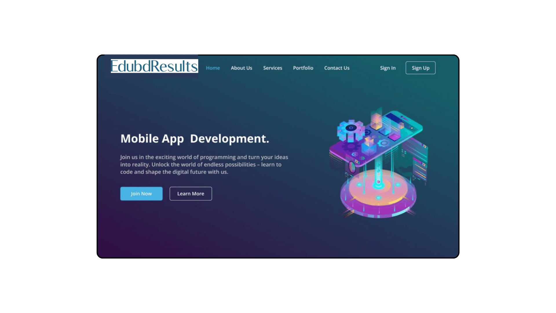
Nowadays, knowing the fundamentals of web development might come in quite handy. Starting with a basic website homepage is an excellent place to start if you want to experiment with web design, establish a blog, or display your portfolio.
I’ll walk you through the process of utilizing HTML and CSS to create your first website homepage in this tutorial that is suitable for beginners. You will discover how to create an interesting and visually beautiful website by learning how to arrange items on the page, create an interactive homepage with a navigation bar, and style each element.
To create a responsive website homepage, we will use commonly used HTML elements like div, h2, h1, and button, as well as basic CSS properties. This project is beginner-friendly, so you should have no trouble following along.
Steps to Create Website Homepage HTML & CSS
To create a responsive website homepage using HTML and CSS, follow these simple step-by-step instructions:
- First, create a folder with any name you like. Then, make the necessary files inside it.
- Create a file called
index.htmlto serve as the main file. - Create a file called
style.cssfor the CSS code.
To start, add the following HTML codes to your index.html file: This code includes essential HTML markup with different semantic tags like header, nav, h2, div, p, ul, li, buttons, etc. to create a website homepage.
You Might Like This:
- Responsive Drop Down Menu with Sub Menu Using HTML & CSS [ Free Source Code]
- How To Create Responsive Navigation Bar Uisng HTML CSS & JavaScript
- Sticky Navigation Bar Using HTML & CSS
- Navigation Menu Hover Animation Using HTML and CSS
<!DOCTYPE html>
<!-- Coding By CodingNepal - www.codingnepalweb.com -->
<html lang="en">
  <head>
    <meta charset="UTF-8" />
    <meta name="viewport" content="width=device-width, initial-scale=1.0" />
    <title>Responsive Website Homepage HTML and CSS | CodingNepal</title>
    <link rel="stylesheet" href="style.css" />
  </head>
  <body>
    <header class="header">
      <nav class="navbar">
        <h2 class="logo"><a href="#">CodingNepal</a></h2>
        <input type="checkbox" id="menu-toggle" />
        <label for="menu-toggle" id="hamburger-btn">
          <svg xmlns="http://www.w3.org/2000/svg" height="24" viewBox="0 0 24 24" width="24">
            <path d="M3 12h18M3 6h18M3 18h18" stroke="currentColor" stroke-width="2" stroke-linecap="round"/>
          </svg>
        </label>
        <ul class="links">
          <li><a href="#">Home</a></li>
          <li><a href="#">About Us</a></li>
          <li><a href="#">Services</a></li>
          <li><a href="#">Portfolio</a></li>
          <li><a href="#">Contact Us</a></li>
        </ul>
        <div class="buttons">
          <a href="#" class="signin">Sign In</a>
          <a href="#" class="signup">Sign Up</a>
        </div>
      </nav>
    </header>
    <section class="hero-section">
      <div class="hero">
        <h2>Mobile App Development</h2>
        <p>
          Join us in the exciting world of programming and turn your ideas into
          reality. Unlock the world of endless possibilities - learn to code and
          shape the digital future with us.
        </p>
        <div class="buttons">
          <a href="#" class="join">Join Now</a>
          <a href="#" class="learn">Learn More</a>
        </div>
      </div>
      <div class="img">
        <img src="https://www.codingnepalweb.com/demos/create-responsive-website-html-css/hero-bg.png" alt="hero image" />
      </div>
    </section>
  </body>
</html>
Next, add the following CSS codes to your style.css file to apply visual styling to the homepage, like color, font, background, etc. After that, you can view your attractive and responsive website homepage by loading the web page in your browser.
/* Importing Google font - Open Sans */
@import url("https://fonts.googleapis.com/css2?family=Open+Sans:wght@300;400;500;600;700&display=swap");

* {
  margin: 0;
  padding: 0;
  box-sizing: border-box;
  font-family: "Open Sans", sans-serif;
}

body {
  height: 100vh;
  width: 100%;
  background: linear-gradient(to bottom, #175d69 23%, #330c43 95%);
}

.header {
  position: fixed;
  top: 0;
  left: 0;
  width: 100%;
}

.navbar {
  display: flex;
  align-items: center;
  justify-content: space-between;
  max-width: 1200px;
  margin: 0 auto;
  padding: 20px 15px;
}

.navbar .logo a {
  font-size: 1.8rem;
  text-decoration: none;
  color: #fff;
}

.navbar .links {
  display: flex;
  align-items: center;
  list-style: none;
  gap: 35px;
}

.navbar .links a {
  font-weight: 500;
  text-decoration: none;
  color: #fff;
  padding: 10px 0;
  transition: 0.2s ease;
}

.navbar .links a:hover {
  color: #47b2e4;
}

.navbar .buttons a {
  text-decoration: none;
  color: #fff;
  font-size: 1rem;
  padding: 15px 0;
  transition: 0.2s ease;
}

.navbar .buttons a:not(:last-child) {
  margin-right: 30px;
}

.navbar .buttons .signin:hover {
  color: #47b2e4;
}

.navbar .buttons .signup {
  border: 1px solid #fff;
  padding: 10px 20px;
  border-radius: 0.375rem;
  text-align: center;
  transition: 0.2s ease;
}

.navbar .buttons .signup:hover {
  background-color: #47b2e4;
  color: #fff;
}

.hero-section {
  display: flex;
  justify-content: space-evenly;
  align-items: center;
  height: 95vh;
  padding: 0 15px;
  max-width: 1200px;
  margin: 0 auto;
}

.hero-section .hero {
  max-width: 50%;
  color: #fff;
}

.hero h2 {
  font-size: 2.5rem;
  margin-bottom: 20px;
}

.hero p {
  font-size: 1.2rem;
  margin-bottom: 20px;
  color: #c9c7c7;
}

.hero-section .img img {
  width: 517px;
}

.hero-section .buttons {
  margin-top: 40px;
}

.hero-section .buttons a {
  text-decoration: none;
  color: #fff;
  padding: 12px 24px;
  border-radius: 0.375rem;
  font-weight: 600;
  transition: 0.2s ease;
  display: inline-block;
}

.hero-section .buttons a:not(:last-child) {
  margin-right: 15px;
}

.buttons .join {
  background-color: #47b2e4;
}

.hero-section .buttons .learn {
  border: 1px solid #fff;
  border-radius: 0.375rem;
}

.hero-section .buttons a:hover {
  background-color: #47b2e4;
}

/* Hamburger menu styles */
#menu-toggle {
  display: none;
}

#hamburger-btn {
  font-size: 1.8rem;
  color: #fff;
  cursor: pointer;
  display: none;
  order: 1;
}

@media screen and (max-width: 1023px) {
  .navbar .logo a {
    font-size: 1.5rem;
  }

  .links {
    position: fixed;
    left: -100%;
    top: 75px;
    width: 100%;
    height: 100vh;
    padding-top: 50px;
    background: #175d69;
    flex-direction: column;
    transition: 0.3s ease;
  }

  .navbar #menu-toggle:checked ~ .links {
    left: 0;
  }

  .navbar #hamburger-btn {
    display: block;
  }

  .header .buttons {
    display: none;
  }

  .hero-section .hero {
    max-width: 100%;
    text-align: center;
  }

  .hero-section img {
    display: none;
  }
}
Conclusion and final words
In conclusion, creating a website homepage is a simple but valuable project for a beginner web developer. I believe that by following the steps in this post, you’ve successfully created your very first responsive website homepage using HTML and CSS.
Remember to experiment and customize your website to add personal touches and make it even more beautiful. To continue improving your HTML and CSS skills, why not try recreating other attractive website designs available on this website? These designs are not limited to simple homepage designs but also include complete website designs.
If you encounter any problems while creating your website homepage, you can download the source code files for this homepage project for free by clicking the Download button. Additionally, you can view a live demo of it by clicking the View Live button.