Fullscreen Overlay Navigation Menu Bar in HTML & CSS
Hi there, readers You’ll discover how to make a Fullscreen Overlay Navigation Menu Bar with using HTML and CSS in today’s blog post. I previously wrote a blog post on how to use HTML, CSS, and JavaScript to build an animated full-screen search bar. And now, using just CSS, I’ll make an eye-catching yet simple fullscreen overlay navigation menu.
a full-page navigation menu that pushes the existing content off the screen in its stead. A website’s menu is a collection of connected elements that makes it easier to navigate between its many pages or sections. Various menu types exist, contingent on the content and design of the website.
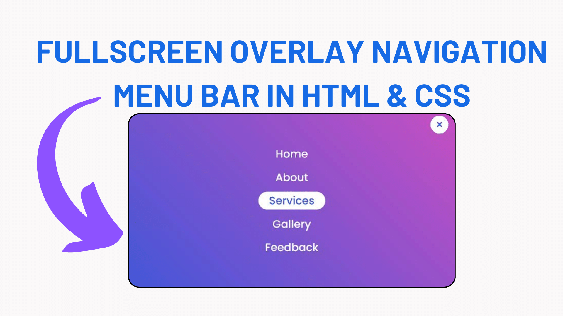
In this program (Fullscreen Overlay Navigation Menu Bar ), at first, on the webpage, there is only a menu button on the top right corner and when you click on that button then the gradient background flow from that corner then show the navigation links. There is also a background animation when you hover on a particular menu item. This design is fully based on only HTML & CSS.
If you’re feeling difficult to understand what I am saying. You can watch a full video tutorial on this program (Fullscreen Overlay Navigation Menu Bar).
Video Tutorial of Fullscreen Overlay Navigation Menu Bar
In the video, you’ve seen the fullscreen overlay animation and I hope you’ve understood the basic codes behind creating this program. As you know I didn’t use JavaScript on this program. To create a clickable button and active the fullscreen overlay screen, I’ve used HTML input type=”checkbox” and label tag.
If you know JavaScript, then you can also use JavaScript on this program and can take this program to the next level by using advanced JavaScript features.
If you like this program (Fullscreen Overlay Navigation Menu Bar) and want to get source codes. You can easily get the source codes of this program. To get the source codes you just need to scroll down. You can use this program in your HTML pages, websites, and projects.
You Might Like This:
- Navigation Bar with Scrolling to the Top Button
- Responsive Neumorphism Navigation Bar using HTML & CSS
- Responsive Navigation Menu Bar Using HTML CSS
- How to Use HTML and CSS to Make a Responsive Fiverr Website
Fullscreen Overlay Navigation Menu Bar [Free Source Codes]
To create this program (Fullscreen Overlay Navigation Menu Bar). First, you need to create two Files one HTML File and another one is CSS File. After creating these files just paste the following codes in your file.
First, create an HTML file with the name of index.html and paste the given codes in your HTML file. Remember, you’ve to create a file with .html extension.
<!DOCTYPE html>
<html lang="en" dir="ltr">
   <head>
      <meta charset="utf-8">
      <title>Fullscreen Overlay Navigation | CodingNepal</title>
      <link rel="stylesheet" href="style.css">
      <link rel="stylesheet" href="https://cdnjs.cloudflare.com/ajax/libs/font-awesome/5.15.3/css/all.min.css"/>
   </head>
   <body>
      <input type="checkbox" id="active">
      <label for="active" class="menu-btn"><i class="fas fa-bars"></i></label>
      <div class="wrapper">
         <ul>
            <li><a href="#">Home</a></li>
            <li><a href="#">About</a></li>
            <li><a href="#">Services</a></li>
            <li><a href="#">Gallery</a></li>
            <li><a href="#">Feedback</a></li>
         </ul>
      </div>
      <div class="content">
         <div class="title">
            Fullscreen Overlay Navigation Bar
         </div>
         <p>
            using only HTML & CSS
         </p>
      </div>
   </body>
</html>Second, create a CSS file with the name of style.css and paste the given codes in your CSS file. Remember, you’ve to create a file with .css extension.
@import url('https://fonts.googleapis.com/css?family=Poppins:400,500,600,700&display=swap');
*{
  margin: 0;
  padding: 0;
  box-sizing: border-box;
  font-family: 'Poppins', sans-serif;
}
.wrapper{
  position: fixed;
  top: 0;
  left: 0;
  height: 100%;
  width: 100%;
  background: linear-gradient(-135deg, #c850c0, #4158d0);
  /* background: linear-gradient(375deg, #1cc7d0, #2ede98); */
  /* clip-path: circle(25px at calc(0% + 45px) 45px); */
  clip-path: circle(25px at calc(100% - 45px) 45px);
  transition: all 0.3s ease-in-out;
}
#active:checked ~ .wrapper{
  clip-path: circle(75%);
}
.menu-btn{
  position: absolute;
  z-index: 2;
  right: 20px;
  /* left: 20px; */
  top: 20px;
  height: 50px;
  width: 50px;
  text-align: center;
  line-height: 50px;
  border-radius: 50%;
  font-size: 20px;
  color: #fff;
  cursor: pointer;
  background: linear-gradient(-135deg, #c850c0, #4158d0);
  /* background: linear-gradient(375deg, #1cc7d0, #2ede98); */
  transition: all 0.3s ease-in-out;
}
#active:checked ~ .menu-btn{
  background: #fff;
  color: #4158d0;
}
#active:checked ~ .menu-btn i:before{
  content: "\f00d";
}
.wrapper ul{
  position: absolute;
  top: 50%;
  left: 50%;
  transform: translate(-50%, -50%);
  list-style: none;
  text-align: center;
}
.wrapper ul li{
  margin: 15px 0;
}
.wrapper ul li a{
  color: none;
  text-decoration: none;
  font-size: 30px;
  font-weight: 500;
  padding: 5px 30px;
  color: #fff;
  position: relative;
  line-height: 50px;
  transition: all 0.3s ease;
}
.wrapper ul li a:after{
  position: absolute;
  content: "";
  background: #fff;
  width: 100%;
  height: 50px;
  left: 0;
  border-radius: 50px;
  transform: scaleY(0);
  z-index: -1;
  transition: transform 0.3s ease;
}
.wrapper ul li a:hover:after{
  transform: scaleY(1);
}
.wrapper ul li a:hover{
  color: #4158d0;
}
input[type="checkbox"]{
  display: none;
}
.content{
  position: absolute;
  top: 50%;
  left: 50%;
  transform: translate(-50%, -50%);
  z-index: -1;
  text-align: center;
  width: 100%;
  color: #202020;
}
.content .title{
  font-size: 40px;
  font-weight: 700;
}
.content p{
  font-size: 35px;
  font-weight: 600;
}
That’s all, now you’ve successfully created a Fullscreen Overlay Navigation Menu Bar using only HTML & CSS. If your code doesn’t work or you’ve faced any error/problem then please comment down or contact us from the contact page.

[…] Fullscreen Overlay Navigation Menu Bar in HTML & CSS […]
[…] Fullscreen Overlay Navigation Menu Bar in HTML & CSS […]
[…] Fullscreen Overlay Navigation Menu Bar in HTML & CSS […]
[…] Fullscreen Overlay Navigation Menu Bar in HTML & CSS […]