How To Build A Responsive Coffee Website in HTML and CSS
Creating a responsive coffee website in HTML and CSS can be a fun and rewarding project. A responsive website adapts to different screen sizes and devices, ensuring that it looks and functions well on desktops, tablets, and smartphones. Here’s a step-by-step guide on how to create one:
- Planning and Design:
Start by planning the structure and design of your coffee website. Consider what elements you want to include, such as a homepage, menu, gallery, contact information, and social media links. Sketch out a rough layout. - HTML Structure:
Begin by creating the HTML structure of your website. Use HTML tags to define headings, paragraphs, lists, and other content. Organize your content into sections using<div>or semantic HTML5 elements like<header>,<nav>,<main>,<section>, and<footer>. - CSS Styling:
Use CSS to style your website. Apply fonts, colors, and layouts to make it visually appealing. Ensure that your CSS code is organized and uses classes and IDs to target specific elements for styling. - Responsive Design:
To make your website responsive, use CSS media queries. These queries allow you to set different styles for different screen sizes. Common breakpoints include mobile (320px-768px), tablet (769px-1024px), and desktop (1025px and above). - Flexbox and Grid:
CSS Flexbox and Grid layouts are powerful tools for creating responsive designs. They allow you to control the placement and alignment of elements within your website’s layout. - Navigation Menu:
Create a responsive navigation menu that collapses into a mobile-friendly menu for smaller screens. You can use HTML lists and CSS for this purpose. - Images and Media:
Optimize images for the web to ensure fast loading times. Use the<img>tag and CSS to control image sizes and responsiveness. Embed videos or other media if necessary. - Testing:
Regularly test your website on different devices and browsers to ensure it looks and works as expected. Debug any issues that arise during testing. - SEO and Accessibility:
Optimize your website for search engines (SEO) by adding relevant meta tags and keywords. Make sure your site is accessible by following accessibility best practices, such as providing alt text for images. - Deployment:
Once you’re satisfied with your coffee website, you can deploy it to a web hosting platform of your choice. Popular options include GitHub Pages, Netlify, or traditional web hosting providers.
By following these steps, you can create a responsive coffee website that showcases your love for coffee and your web development skills. Good luck with your project!
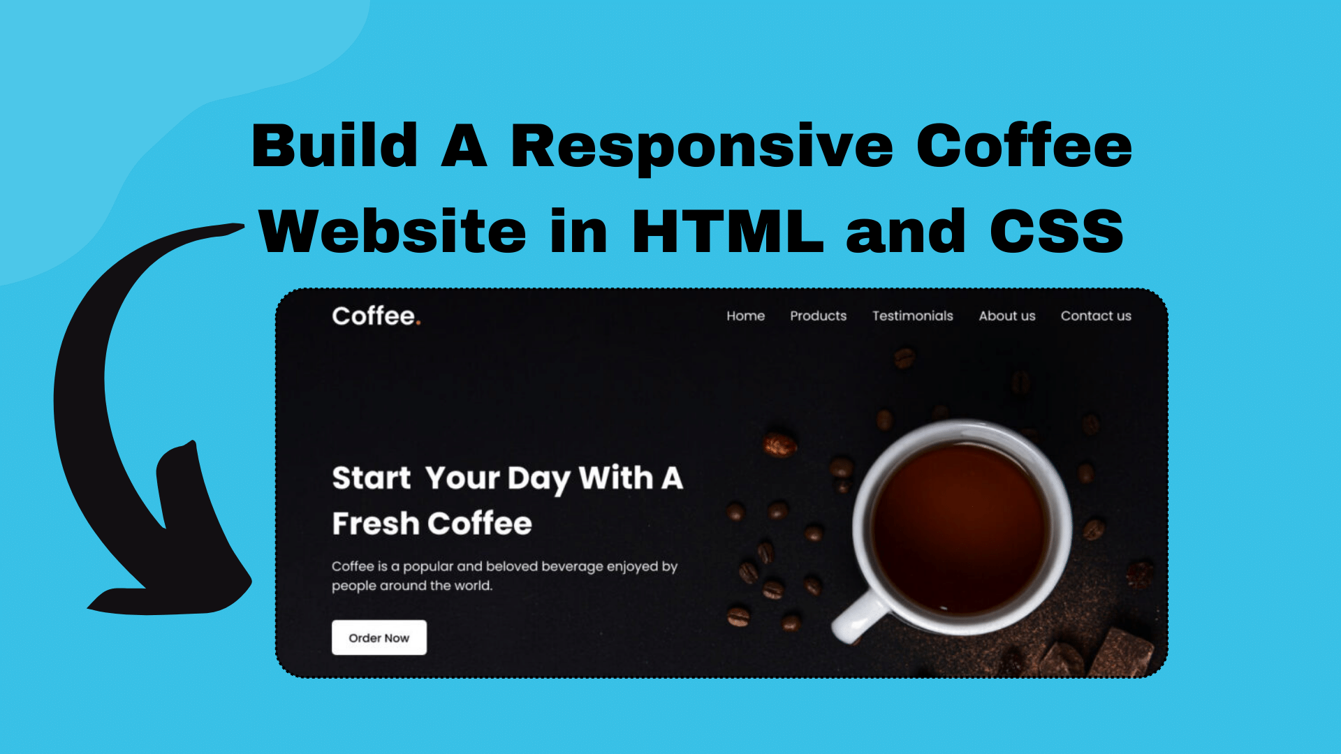
- HTML FILE
<!DOCTYPE html>
<!-- Coding By CodingNepal - www.codingnepalweb.com -->
<html lang="en">
  <head>
    <meta charset="UTF-8">
    <meta name="viewport" content="width=device-width, initial-scale=1.0">
    <title>Coffee Website HTML and CSS | CodingNepal</title>
    <link rel="stylesheet" href="style.css">
    <!-- Google Fonts Links For Icon -->
    <link rel="stylesheet" href="https://fonts.googleapis.com/css2?family=Material+Symbols+Outlined:opsz,wght,FILL,GRAD@24,400,0,0">
  </head>
  <body>
    <header>
      <nav class="navbar">
        <a class="logo" href="#">Coffee<span>.</span></a>
        <ul class="menu-links">
          <span id="close-menu-btn" class="material-symbols-outlined">close</span>
          <li><a href="#">Home</a></li>
          <li><a href="#">Products</a></li>
          <li><a href="#">Testimonials</a></li>
          <li><a href="#">About us</a></li>
          <li><a href="#">Contact us</a></li>
        </ul>
        <span id="hamburger-btn" class="material-symbols-outlined">menu</span>
      </nav>
    </header>

    <section class="hero-section">
      <div class="content">
        <h2>Start Your Day With Fresh Coffee</h2>
        <p>
          Coffee is a popular and beloved beverage enjoyed by
          people around the world.Awaken your senses with a steaming cup of liquid motivation.
        </p>
        <button>Order Now</button>
      </div>
    </section>

    <script>
      const header = document.querySelector("header");
      const hamburgerBtn = document.querySelector("#hamburger-btn");
      const closeMenuBtn = document.querySelector("#close-menu-btn");

      // Toggle mobile menu on hamburger button click
      hamburgerBtn.addEventListener("click", () => header.classList.toggle("show-mobile-menu"));

      // Close mobile menu on close button click
      closeMenuBtn.addEventListener("click", () => hamburgerBtn.click());
    </script>

  </body>
</html>- CSS FILE
/* Importing Google font - Poppins */
@import url('https://fonts.googleapis.com/css2?family=Poppins:wght@300;400;500;600;700&display=swap');

* {
  margin: 0;
  padding: 0;
  box-sizing: border-box;
  font-family: 'Poppins', sans-serif;
}

header {
  position: fixed;
  top: 0;
  left: 0;
  width: 100%;
  padding: 20px;
}

header .navbar {
  display: flex;
  align-items: center;
  justify-content: space-between;
  max-width: 1200px;
  margin: 0 auto;
}

.navbar .logo {
  color: #fff;
  font-weight: 600;
  font-size: 2.1rem;
  text-decoration: none;
}

.navbar .logo span {
  color: #C06B3E;
}

.navbar .menu-links {
  display: flex;
  list-style: none;
  gap: 35px;
}

.navbar a {
  color: #fff;
  text-decoration: none;
  transition: 0.2s ease;
}

.navbar a:hover {
  color: #C06B3E;
}

.hero-section {
  height: 100vh;
  background-image: url("https://www.codingnepalweb.com/demos/create-responsive-coffee-website-html-css/hero-bg.jpg");
  background-position: center;
  background-size: cover;
  display: flex;
  align-items: center;
  padding: 0 20px;
}

.hero-section .content {
  max-width: 1200px;
  margin: 0 auto;
  width: 100%;
  color: #fff;
}

.hero-section .content h2 {
  font-size: 3rem;
  max-width: 600px;
  line-height: 70px;
}

.hero-section .content p {
  font-weight: 300;
  max-width: 600px;
  margin-top: 15px;
}

.hero-section .content button {
  background: #fff;
  padding: 12px 30px;
  border: none;
  font-size: 1rem;
  border-radius: 6px;
  margin-top: 38px;
  cursor: pointer;
  font-weight: 500;
  transition: 0.2s ease;
}

.hero-section .content button:hover {
  color: #fff;
  background: #C06B3E;
}

#close-menu-btn {
  position: absolute;
  right: 20px;
  top: 20px;
  cursor: pointer;
  display: none;
}

#hamburger-btn {
  color: #fff;
  cursor: pointer;
  display: none;
}

@media (max-width: 768px) {
  header {
    padding: 10px;
  }

  header.show-mobile-menu::before {
    content: "";
    position: fixed;
    left: 0;
    top: 0;
    width: 100%;
    height: 100%;
    backdrop-filter: blur(5px);
  }

  .navbar .logo {
    font-size: 1.7rem;
  }


  #hamburger-btn, #close-menu-btn {
    display: block;
  }

  .navbar .menu-links {
    position: fixed;
    top: 0;
    left: -250px;
    width: 250px;
    height: 100vh;
    background: #fff;
    flex-direction: column;
    padding: 70px 40px 0;
    transition: left 0.2s ease;
  }

  header.show-mobile-menu .navbar .menu-links {
    left: 0;
  }

  .navbar a {
    color: #000;
  }

  .hero-section .content {
    text-align: center;
  }

  .hero-section .content :is(h2, p) {
    max-width: 100%;
  }

  .hero-section .content h2 {
    font-size: 2.3rem;
    line-height: 60px;
  }

  .hero-section .content button {
    padding: 9px 18px;
  }
}- Output:

In conclusion, creating a responsive website is a valuable and rewarding experience for beginners in the world of web development. I believe that by following the steps and the codes in this post, you’ve successfully created your responsive coffee website using HTML and CSS.

[…] download the Images folder and place it in your project directory. This folder contains all the images you’ll need for this […]