How to Create a Responsive Personal Portfolio with HTML, CSS, and Bootstrap
For web developers, creating a personal portfolio website is a useful skill. You may promote your skills or services on an eye-catching, responsive, and useful website with HTML, CSS, and Bootstrap.
In this blog post, we will guide you through the process of building a responsive portfolio website that includes key sections such as Home, Skills, Portfolio, About Us, Curriculum Vitae (CV), Contact Us Form, and Footer.
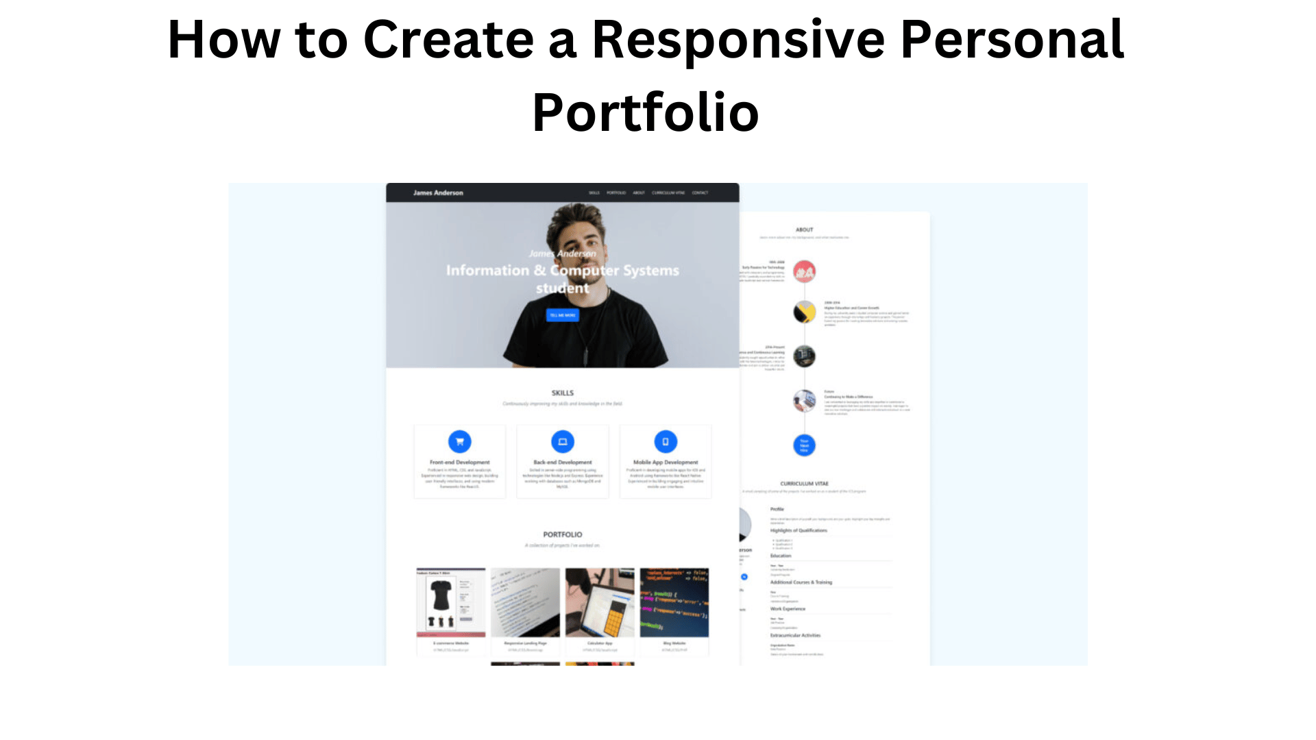
A navigation bar, a background picture, explanatory text, and a call-to-action button will all be included in the Home area. Your abilities and knowledge will be showcased on visually appealing cards in the skills section. Using eye-catching picture cards, your completed projects will be displayed in the Portfolio area.
Your career experience will be highlighted in the About Us section with a vertical chronological structure showcasing your accomplishments. In a resume-style structure, the Curriculum Vitae (CV) section will highlight pertinent personal and professional information.
The Contact Us section will feature a contact form with fields for email, username, phone number, and message, and finally, the Footer section will feature a copyright message and some social media buttons.
You Might Like This:
- Learn to Code: Netflix-Like Login Page in HTML and CSS
- Create Website with Login & Registration Form Using HTML CSS and JavaScript
- Create A Glassmorphism Login Form Using HTML and CSS
- Create A Beautiful Responsive Website Using HTML and CSS
Steps For Creating Responsive Portfolio Website in Bootstrap
To create a responsive personal portfolio website using HTML, CSS, and Bootstrap follow the given steps line by line:
- Create a folder. You can name this folder whatever you want, and inside this folder, create the mentioned files.
- Create an
index.htmlfile. The file name must be index and its extension .html - Create a
style.cssfile. The file name must be style and its extension .css - Download the images folder and put this folder inside the project folder. This folder has all the images that will be used for this portfolio website. But, if you want, you can use your own images.
To start, add the following HTML codes to your index.html file: These codes include all the necessary CDN links, website layout, and different sections. Since we’ve used Bootstrap for the portfolio website, it’s nearly complete here without the need for extensive custom CSS.
Remember, adding your own personal touch by customizing the website with your unique details and requirements can greatly enhance its overall appeal.
<!DOCTYPE html>
<html lang="en">
  <head>
    <meta charset="UTF-8" />
    <meta name="viewport" content="width=device-width, initial-scale=1.0" />
    <title>Portfolio Website | CodingNepal</title>
    <!-- Linking CSS File -->
    <link rel="stylesheet" href="css/style.css" />
    <!-- Fontawesome link -->
    <link href="https://cdn.jsdelivr.net/npm/[email protected]/dist/css/bootstrap.min.css" rel="stylesheet" integrity="sha384-GLhlTQ8iRABdZLl6O3oVMWSktQOp6b7In1Zl3/Jr59b6EGGoI1aFkw7cmDA6j6gD" crossorigin="anonymous">
    <!-- Bootstrap link -->
    <link rel="stylesheet" href="https://cdnjs.cloudflare.com/ajax/libs/font-awesome/6.3.0/css/all.min.css" />
  </head>
  <body>
    <!-- Header & Navbar -->
    <header class="bg-dark fixed-top">
      <nav class="container-xxl navbar navbar-expand-lg py-3 bg-dark navbar-dark">
        <div class="container-fluid">
          <a class="navbar-brand fw-bold fs-3" href="#">James Anderson</a>
          <button class="navbar-toggler" type="button" data-bs-toggle="collapse" data-bs-target="#navbarSupportedContent" aria-controls="navbarSupportedContent" aria-expanded="false" aria-label="Toggle navigation">
            <span class="navbar-toggler-icon"></span>
          </button>
          <div class="collapse navbar-collapse" id="navbarSupportedContent">
            <ul class="navbar-nav ms-auto mb-2 mb-lg-0">
              <li class="nav-item mx-2">
                <a class="nav-link" href="#skills">SKILLS</a>
              </li>
              <li class="nav-item mx-2">
                <a class="nav-link" href="#portfolio">PORTFOLIO</a>
              </li>
              <li class="nav-item mx-2">
                <a class="nav-link" href="#about">ABOUT</a>
              </li>
              <li class="nav-item mx-2">
                <a class="nav-link" href="#cv">CURRICULUM VITAE</a>
              </li>
              <li class="nav-item mx-2">
                <a class="nav-link" href="#contact">CONTACT</a>
              </li>
          </div>
        </div>
      </nav>
    </header>

    <!-- Hero or Showcase Section -->
    <section class="hero d-flex flex-column align-items-center justify-content-center">
      <div class="text-center">
        <h1 class="h1 text-white fw-medium fst-italic">James Anderson</h1>
        <h2 class="display-3 text-white fw-bold">Information & Computer Systems <br /> student</h2>
        <a href="#skills" class="btn btn-lg fs-6 fw-medium mt-5 btn-primary p-3">TELL ME MORE</a>
      </div>
    </section>

    <!-- Skills Section -->
    <section class="container py-5" id="skills">
      <div class="row mt-4 py-3">
        <div class="col-12 d-flex flex-column text-center justify-content-center">
          <h2>SKILLS</h2>
          <h5 class="text-secondary fw-normal py-2 fst-italic">Continuously improving my skills and knowledge in the field.</h5>
        </div>
      </div>
      <div class="row d-flex justify-content-between mx-0">
        <div class="card mt-5 d-flex flex-column align-items-center text-center bg-white p-4" style="width: 25rem">
          <i class="text-white bg-primary d-flex align-items-center justify-content-center fs-2 rounded-circle fa-solid fa-cart-shopping"></i>
          <h3 class="mt-4 h4">Front-end Development</h3>
          <p class="text-center">Proficient in HTML, CSS, and JavaScript. Experienced in responsive web design, building user-friendly interfaces, and using modern frameworks like ReactJS.</p>
        </div>
        <div class="card mt-5 d-flex flex-column align-items-center text-center bg-white p-4" style="width: 25rem">
          <i class="text-white bg-primary d-flex align-items-center justify-content-center fs-2 rounded-circle fa-solid fa-laptop"></i>
          <h3 class="mt-4 h4">Back-end Development</h3>
          <p class="text-center">Skilled in server-side programming using technologies like Node.js and Express. Experience working with databases such as MongoDB and MySQL.</p>
        </div>
        <div class="card mt-5 d-flex flex-column align-items-center text-center bg-white p-4" style="width: 25rem">
          <i class="text-white bg-primary d-flex align-items-center justify-content-center fs-2 rounded-circle fa-solid fa-mobile-screen-button"></i>
          <h3 class="mt-4 h4">Mobile App Development</h3>
          <p class="text-center">Proficient in developing mobile apps for iOS and Android using frameworks like React Native. Experienced in building engaging and intuitive mobile user interfaces.</p>
        </div>
      </div>
    </section>

    <!-- Portfolio Section -->
    <section class="container py-5" id="portfolio">
      <div class="row mt-4 py-3">
        <div class="col-12 d-flex flex-column text-center justify-content-center">
          <h2>PORTFOLIO</h2>
          <h5 class="text-secondary fw-normal py-2 fst-italic">A collection of projects I've worked on.</h5>
        </div>
        <div class="row mt-5 mx-0 justify-content-center align-items-center">
          <div class="col-lg-3 px-md-3 px-0 col-md-4 col-12 card-wrapper">
            <div class="card mt-4">
              <img src="images/ecommerce.png" class="img-fluid" alt="portfolio-img">
              <div class="card-body text-center">
                <h6 class="card-title">E-commerce Website</h6>
                <p class="card-text text-secondary">HTML/CSS/JavaScript</p>
              </div>
            </div>
          </div>
          <div class="col-lg-3 px-md-3 px-0 col-md-4 card-wrapper">
            <div class="card mt-4">
              <img src="images/landing-page.jpg" class="img-fluid" alt="portfolio-img">
              <div class="card-body text-center">
                <h6 class="card-title">Responsive Landing Page</h6>
                <p class="card-text text-secondary">HTML/CSS/Bootstrap</p>
              </div>
            </div>
          </div>
          <div class="col-lg-3 px-md-3 px-0 col-md-4 card-wrapper">
            <div class="card mt-4">
              <img src="images/calculator-app.jpg" class="img-fluid" alt="portfolio-img">
              <div class="card-body text-center">
                <h6 class="card-title">Calculator App</h6>
                <p class="card-text text-secondary">HTML/CSS/JavaScript</p>
              </div>
            </div>
          </div>
          <div class="col-lg-3 px-md-3 px-0 col-md-4 card-wrapper">
            <div class="card mt-4">
              <img src="images/blog.jpg" class="img-fluid" alt="portfolio-img">
              <div class="card-body text-center">
                <h6 class="card-title">Blog Website</h6>
                <p class="card-text text-secondary">HTML/CSS/PHP</p>
              </div>
            </div>
          </div>
          <div class="col-lg-3 px-md-3 px-0 col-md-4 card-wrapper">
            <div class="card mt-4">
              <img src="images/react.jpg" class="img-fluid" alt="portfolio-img">
              <div class="card-body text-center">
                <h6 class="card-title">Task Management App</h6>
                <p class="card-text text-secondary">ReactJS</p>
              </div>
            </div>
          </div>
          <div class="col-lg-3 px-md-3 px-0 col-md-4 card-wrapper">
            <div class="card mt-4">
              <img src="images/python.jpg" class="img-fluid" alt="portfolio-img">
              <div class="card-body text-center">
                <h6 class="card-title">Data Visualization</h6>
                <p class="card-text text-secondary">Python/Plotly</p>
              </div>
            </div>
          </div>
        </div>
      </div>
    </section>

    <!-- About Section -->
    <section class="container py-5" id="about">
      <div class="row mt-4 py-3">
        <div class="col-12 d-flex flex-column text-center">
          <h2>ABOUT</h2>
          <h5 class="text-secondary fw-normal py-2 fst-italic">Learn more about me, my background, and what motivates me.</h5>
        </div>
      </div>
      <div class="row flex-row-reverse flex-md-row mt-5 pt-5">
        <div class="col-9 col-md-5 text-md-end">
          <h5>1995-2008</h5>
          <h5>Early Passion for Technology</h5>
          <p>From an early age, I became fascinated with computers and programming. Starting with basic HTML and CSS, I gradually expanded my skills to include JavaScript and various frameworks.</p>
        </div>
        <div class="col-3 col-md-2 img text-center">
          <img class="rounded-circle border border-5 border-dark-subtle img-fluid" src="images/about-img-1.jpg" alt="img">
        </div>
      </div>
      <div class="row justify-content-md-end mt-5 pt-5">
        <div class="col-3 col-md-2 img text-center">
          <img class="rounded-circle border border-5 border-dark-subtle img-fluid" src="images/about-img-2.jpg" alt="img">
        </div>
        <div class="col-9 col-md-5">
          <h5>2008-2014</h5>
          <h5>Higher Education and Career Growth</h5>
          <p>During my university years, I studied computer science and gained hands-on experience through internships and freelance projects. This period fueled my passion for creating innovative solutions and solving complex problems.</p>
        </div>
      </div>
      <div class="row flex-row-reverse flex-md-row mt-5 pt-5">
        <div class="col-9 col-md-5 text-md-end">
          <h5>2014-Present</h5>
          <h5>Professional Excellence and Continuous Learning</h5>
          <p>Throughout my career, I have consistently sought opportunities to refine my skills and stay updated with the latest technologies. I strive for excellence in every project I undertake and aim to deliver valuable and impactful results.</p>
        </div>
        <div class="col-3 col-md-2 img text-center">
          <img class="rounded-circle border border-5 border-dark-subtle img-fluid" src="images/about-img-3.jpg" alt="img">
        </div>
      </div>
      <div class="row justify-content-md-end mt-5 pt-5">
        <div class="col-3 col-md-2 img text-center">
          <img class="rounded-circle border border-5 border-dark-subtle img-fluid" src="images/about-img-4.jpg" alt="img">
        </div>
        <div class="col-9 col-md-5">
          <h5>Future</h5>
          <h5>Continuing to Make a Difference</h5>
          <p>I am committed to leveraging my skills and expertise to contribute to meaningful projects that have a positive impact on society. I am eager to take on new challenges and collaborate with talented individuals to create innovative solutions.</p>
        </div>
      </div>
      <div class="row justify-content-md-center mt-5 pt-5">
        <div class="col-3 col-md-2 d-flex justify-content-center hire-text">
          <h2 class="h4 d-flex justify-content-center align-items-center bg-primary text-white rounded-circle border border-5 border-dark-subtle"><span class="d-none d-md-block">Your<br>Next<br>Hire</span></h2>
        </div>
      </div>
    </section>

    <!-- Curriculum Vitae Section -->
    <section class="container py-5" id="cv">
      <div class="row mt-4 py-3">
        <div class="col-12 d-flex flex-column text-center">
          <h2>CURRICULUM VITAE</h2>
          <h5 class="text-secondary fw-normal py-2 fst-italic">A small sampling of some of the projects I've worked on as a student of the ICS program.</h5>
        </div>
      </div>
      <div class="row">
        <div class="col-lg-4 mt-5 order-lg-0 order-1 text-center">
          <img class="img-fluid rounded-circle border border-5 border-dark-subtle" src="images/profile-img.jpg" alt="profile-img">
          <h2 class="mt-3">James Anderson</h2>
          <ul class="list-unstyled contact-info">
            <li><i class="fas fa-envelope me-2"></i> [email protected]</li>
            <li><i class="fas fa-phone me-2"></i> (123) 456-7890</li>
            <li><i class="fas fa-map-marker-alt me-2"></i> Your Address</li>
          </ul>
          <ul class="social-icons my-5 d-flex justify-content-center">
            <a href="#" class="bg-primary mx-2 text-white d-flex align-items-center justify-content-center text-decoration-none rounded-circle"><i class="fa-brands fa-twitter"></i></a>
            <a href="#" class="bg-primary mx-2 text-white d-flex align-items-center justify-content-center text-decoration-none rounded-circle"><i class="fa-brands fa-facebook-f"></i></a>
            <a href="#" class="bg-primary mx-2 text-white d-flex align-items-center justify-content-center text-decoration-none rounded-circle"><i class="fa-brands fa-linkedin-in"></i></a>
          </ul>
          <h5>Technical Skills</h5>
          <ul class="list-unstyled">
            <li>HTML</li>
            <li>CSS</li>
            <li>JavaScript</li>
            <!-- Add or remove skills as needed -->
          </ul>
          <h5>Personal Interests</h5>
          <ul class="list-unstyled">
            <li>Interest 1</li>
            <li>Interest 2</li>
            <li>Interest 3</li>
            <!-- Add or remove interests as needed -->
          </ul>
        </div>
        <div class="col-lg-7 order-lg-1 order-0 mt-5 text-start">
          <h3>Profile</h3>
          <hr>
          <p>Write a brief description of yourself, your background, and your goals. Highlight your key strengths and experiences.</p>
          <h3>Highlights of Qualifications</h3>
          <hr>
          <ul>
            <li>Qualification 1</li>
            <li>Qualification 2</li>
            <li>Qualification 3</li>
            <!-- Add or remove qualifications as needed -->
          </ul>
          <h3>Education</h3>
          <hr>
          <dl>
            <dt>Year - Year</dt>
            <dd>University/Institution</dd>
            <dd>Degree/Program</dd>
          </dl>
          <h3>Additional Courses & Training</h3>
          <hr>
          <dl>
            <dt>Year</dt>
            <dd>Course/Training</dd>
            <dd>Institution/Organization</dd>
          </dl>
          <h3>Work Experience</h3>
          <hr>
          <dl>
            <dt>Year - Year</dt>
            <dd>Job Position</dd>
            <dd>Company/Organization</dd>
            <!-- Add or remove work experience entries as needed -->
          </dl>
          <h3>Extracurricular Activities</h3>
          <hr>
          <dl>
            <dt>Organization Name</dt>
            <dd>Role/Position</dd>
            <dd>Details of your involvement and contributions</dd>
          </dl>
        </div>
      </div>
    </section>

     <!-- Contact Section -->
     <section class="py-5" id="contact">
      <div class="container-xxl py-5">
        <div class="col-12 d-flex flex-column text-center justify-content-center">
          <h2 class="text-white">CONTACT ME</h2>
          <h5 class="text-white fw-normal py-2 fst-italic">Interested if I'd be the right fit for your team? Fill in this form and I will respond within 24-48 hours.</h5>
        </div>
        <div class="row pt-4 mt-5">
          <div class="col-12">
            <form action="#" method="POST">
              <div class="row d-flex justify-content-center">
                <div class="col-lg-6">
                  <div class="form-floating mb-3">
                    <input type="text" class="form-control" id="floatingInput" placeholder="Enter Name*" required>
                    <label for="floatingInput">Enter Name*</label>
                  </div>
                  <div class="form-floating mb-3">
                    <input type="email" class="form-control" id="floatingEmail" placeholder="Enter Email*" required>
                    <label for="floatingEmail">Enter Email*</label>
                  </div>
                  <div class="form-floating mb-3">
                    <input type="number" class="form-control" id="floatingPassword" placeholder="Enter Phone*" required>
                    <label for="floatingPassword">Enter Phone*</label>
                  </div>
                </div>
                <div class="form-floating col-lg-6">
                  <textarea class="form-control" placeholder="Leave a comment here" id="floatingMessage" style="height: 205px" required></textarea>
                  <label for="floatingMessage" class="px-4">Enter Message*</label>
                </div>
                <div class="col-12 mt-5 d-flex justify-content-center">
                  <button class="btn btn-lg btn-outline-light">SEND MESSAGE</button>
                </div>
              </div>

            </form>
          </div>
        </div>
       </div>
     </section>

     <!-- Footer -->
     <footer>
      <div class="container-xxl flex-wrap pt-3 d-flex align-items-center justify-content-center justify-content-md-between">
        <p>Copyright © 2023 James Anderson</p>
        <ul class="social-icons d-flex">
          <a href="#" class="bg-primary mx-2 text-white d-flex align-items-center justify-content-center text-decoration-none rounded-circle"><small><i class="fa-brands fa-twitter"></i></small></a>
          <a href="#" class="bg-primary mx-2 text-white d-flex align-items-center justify-content-center text-decoration-none rounded-circle"><small><i class="fa-brands fa-facebook-f"></i></small></a>
          <a href="#" class="bg-primary mx-2 text-white d-flex align-items-center justify-content-center text-decoration-none rounded-circle"><small><i class="fa-brands fa-linkedin-in"></i></small></a>
        </ul>
      </div>
     </footer>

     <!-- Bootstrap script link -->
    <script src="https://cdn.jsdelivr.net/npm/[email protected]/dist/js/bootstrap.bundle.min.js" integrity="sha384-w76AqPfDkMBDXo30jS1Sgez6pr3x5MlQ1ZAGC+nuZB+EYdgRZgiwxhTBTkF7CXvN" crossorigin="anonymous"></script>
  </body>
</html>
Next, add the following few custom CSS codes to your style.css file to style some elements, add background images, and do other things on the website. You can customize this code to your liking by adjusting the color, font, size, and other CSS properties.
/* Color variables */
:root {
  --white-color: #fff;
  --bg-color: #fff;
  --gray-color: #ccc;
}

/* Changing background color */
body {
  background: var(--bg-color) !important;
}

/* Changing link color */
.nav-item .nav-link {
  color: var(--white-color);
}

/* Hero section background image */
.hero {
  height: 100vh;
  background-image: url("../images/home-bg.jpg");
  background-repeat: no-repeat;
  background-position: 60% 0%;
  background-size: cover;
  background-attachment: fixed;
}

#skills i {
  height: 100px;
  width: 100px;
}

#portfolio img {
  height: 300px;
  object-fit: cover;
}

#about .img,
#about img,
.hire-text h2 {
  position: relative;
}

/* Timeline background line */
#about .img::before {
  content: "";
  left: 50%;
  width: 4px;
  position: absolute;
  height: calc(100% + 140px);
  background: var(--gray-color);
}

#about img,
#about .hire-text h2 {
  width: 140px;
}

#about .hire-text h2 {
  height: 140px;
}

.social-icons a {
  width: 40px;
  height: 40px;
}

footer .social-icons a {
  width: 30px;
  height: 30px;
}

#cv img {
  width: 230px;
}

/* Contact section background image */
#contact {
  background-size: cover;
  background-attachment: fixed;
  background-position: center;
  background-image: url("../images/contact-bg.jpeg");
}

@media screen and (max-width: 990px) {
  #skills .card {
    width: calc(100% / 2 - 10px) !important;
  }
}

@media screen and (max-width: 668px) {
  #skills .card,
  #portfolio .card-wrapper {
    width: 100% !important;
  }
 #about .hire-text h2 {
   height: 70px;
   width: 70px;
 }
}
The Conclusion: What We’ve Learned
In conclusion, building a responsive portfolio website using HTML, CSS, and Bootstrap is a valuable skill that boosts your online presence and showcases your talents. By following the provided instructions, you’ve successfully created an attractive and functional personal portfolio website.
Additionally, you can explore a wide range of website design templates available on this platform, all built with HTML, CSS, and JavaScript. These templates not only serve as valuable learning resources for aspiring web developers but also provide practical solutions for various purposes.
If you encounter any difficulties while creating your own portfolio website or your code is not working as expected, you can download the source code files for this portfolio website for free by clicking the Download button.