Navigation Menu Hover Animation Using HTML and CSS
Hi, my pals I hope everyone is doing well. Today, we’re going to construct hover animations, which are crucial and frequently used for all kinds of navigation. As you are well aware, I have designed a number of different kinds of responsive navigation bars. Surely, this kind of little motion and effect improves our design greatly?
Navigation hover animation is the animation that shows when a user hovers over a navigation link. In essence, these animations sense when we click or hover over them.
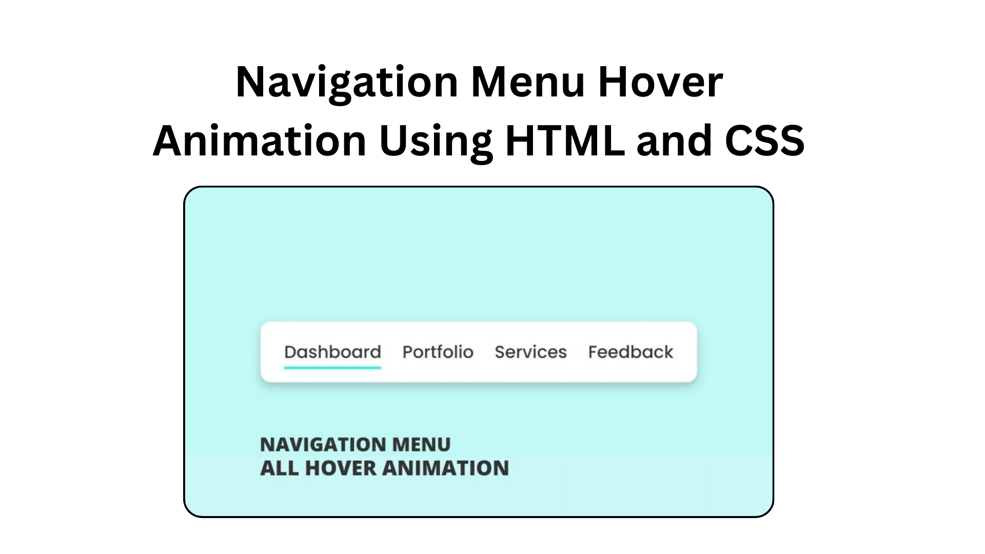
I am aware that you are only seeing one underline beneath the navigation links and that it is unclear if it is active or hovered, as you can see in the provided screenshot of our application (all navigation menu hover animation). In essence, there are several kinds of hover menu animation.
Let’s watch all the hover animation that I have built in this program[Navigation Menu Hover Animation], and one thing after watching the following video tutorial you will not see the demo of these hover animations, you will also know all code that I have used to create this hover animation and effect.
Navigation Menu Hover Animation Using HTML and CSS
I have provided all source code of this all navigation menu hover animations and effects below, but before jumping on the source code files, I would like to cover some important points that you should know.
As you have seen on the video tutorial of all navigation menu bar hover animation and effect using HTML and CSS. At first, we have seen only navigation links, and when I did hover on those every navigation link’s beautiful and different underline animations appear with smooth animation.
In those first, second, and third navigation links I have given position absolute and that underline width increases while we hover on them. On the last navigation link, I have given width 100% and scaleX 0 and transform-origin right, and while we do hover I have given transform scaleX 1 and transform-origin right that’s why it moves forward.
I believe you have got all the ideas and tactics that I have used on this program [Navigation Menu Hover Animation in HTML and CSS] and you can build this type of animation easily but hose friends who are feeling difficult to make this, you can get all the source code of this hover animations from below.
You Might Like This:
- Fullscreen Overlay Navigation Menu Bar in HTML & CSS
- Navigation Bar with Scrolling to the Top Button
- Responsive Neumorphism Navigation Bar using HTML & CSS
- Responsive Navigation Menu Bar Using HTML CSS
Navigation Menu Hover Animation [Free Source Code]
Before copying the given code of Navigation Menu Hover Animation and Effects you need to create two files: an HTML file and a CSS file. After Creating these two files then you can copy-paste the following codes in your documents.
<!DOCTYPE html>
<!-- Coding By CodingNepal - codingnepalweb.com -->
<html lang="en" dir="ltr">
  <head>
    <meta charset="UTF-8">
   <title> All Navigation Menu Hover Animation | CodingLab </title>
    <link rel="stylesheet" href="style.css">
   </head>
<body>
  <ul class="nav-links">
    <li><a href="#">Dashboard</a></li>
    <li class="center"><a href="#">Portfolio</a></li>
    <li class="upward"><a href="#">Services</a></li>
    <li class="forward"><a href="#">Feedback</a></li>
  </ul>

</body>
</html>
/* Google Fonts Import Link */
@import url('https://fonts.googleapis.com/css2?family=Poppins:wght@300;400;500;600;700&display=swap');
*{
margin: 0;
padding: 0;
box-sizing: border-box;
font-family: 'Poppins', sans-serif;
}
body{
height: 100vh;
display: flex;
align-items: center;
justify-content: center;
background: #c1f7f5;
}
.nav-links{
display: flex;
align-items: center;
background: #fff;
padding: 20px 15px;
border-radius: 12px;
box-shadow: 0 5px 10px rgba(0,0,0,0.2);
}
.nav-links li{
list-style: none;
margin: 0 12px;
}
.nav-links li a{
position: relative;
color: #333;
font-size: 20px;
font-weight: 500;
padding: 6px 0;
text-decoration: none;
}
.nav-links li a:before{
content: '';
position: absolute;
bottom: 0;
left: 0;
height: 3px;
width: 0%;
background: #34efdf;
border-radius: 12px;
transition: all 0.4s ease;
}
.nav-links li a:hover:before{
width: 100%;
}
.nav-links li.center a:before{
left: 50%;
transform: translateX(-50%);
}
.nav-links li.upward a:before{
width: 100%;
bottom: -5px;
opacity: 0;
}
.nav-links li.upward a:hover:before{
bottom: 0px;
opacity: 1;
}
.nav-links li.forward a:before{
width: 100%;
transform: scaleX(0);
transform-origin: right;
transition: transform 0.4s ease;
}
.nav-links li.forward a:hover:before{
transform: scaleX(1);
transform-origin: left;
}If you face any difficulties while creating your Navigation Menu Hover Animation or your code is not working as expected, you can download the source code files for this Navbar Menu Hover Animation for free by clicking on the download button, and you can also view a live demo of this card slider by clicking on the view live button.

[…] Navigation Menu Hover Animation Using HTML and CSS […]
[…] Navigation Menu Hover Animation Using HTML and CSS […]